

SANDY ALEXANDER IDENTITY
This project was a group project where we proposed a rebranding of the printing company, Sandy Alexander. Sandy Alexander is a catalyst for the progressive future of visual communication providing environmentally responsible print and multimedia solutions. They communicated with our team that they wanted open, honest communication about their printing techniques, methods, what kind of inks they were using and how sustainable they were striving to be. They are committed to being a leader in environmentally friendly printing.
My team went in the direction of using clean grids, typography, and embracing white space. We didn't want to have anything unnecessary to truly be and live up to the company's ethical standards.
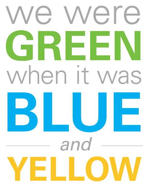
COLOR
My design group wanted to provide the company with a cohesive system across their multiple entities and with one that spoke to what they wanted to portray with their brand. The company was one of the first printing companies to truly utilize environmental solutions for their products and clients, and this was extremely important to them. We came up with the tagline, "We were green when it was blue and yellow" to communicate that they were using green solutions before any other company, and they were true to it.
MAIN COMPANY LOGO
This is the main logo for the company. We loved the idea of playing with mixing colors since the company's main focus is printing. We chose blue and yellow so we could create the color green in the overlapping section to reiterate the company's efforts toward being a leader in environmentally responsible printing.
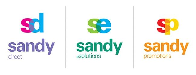
DIVISION LOGOS
Sandy Alexander has three departments that handles the various parts of their printing solutions: Sandy Direct, Sandy eSolutions, and Sandy Promotions. We branded each division with it's own color mix system to stay within the theme of mixing colors.
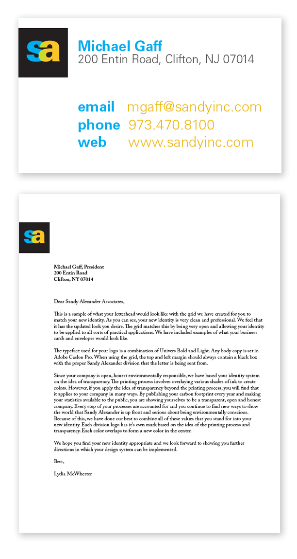
COLLATERAL
Business card and letterhead for Sandy Alexander