lydian candles branding
Art Direction, Brand + Identity Creation: Lydia McWherter
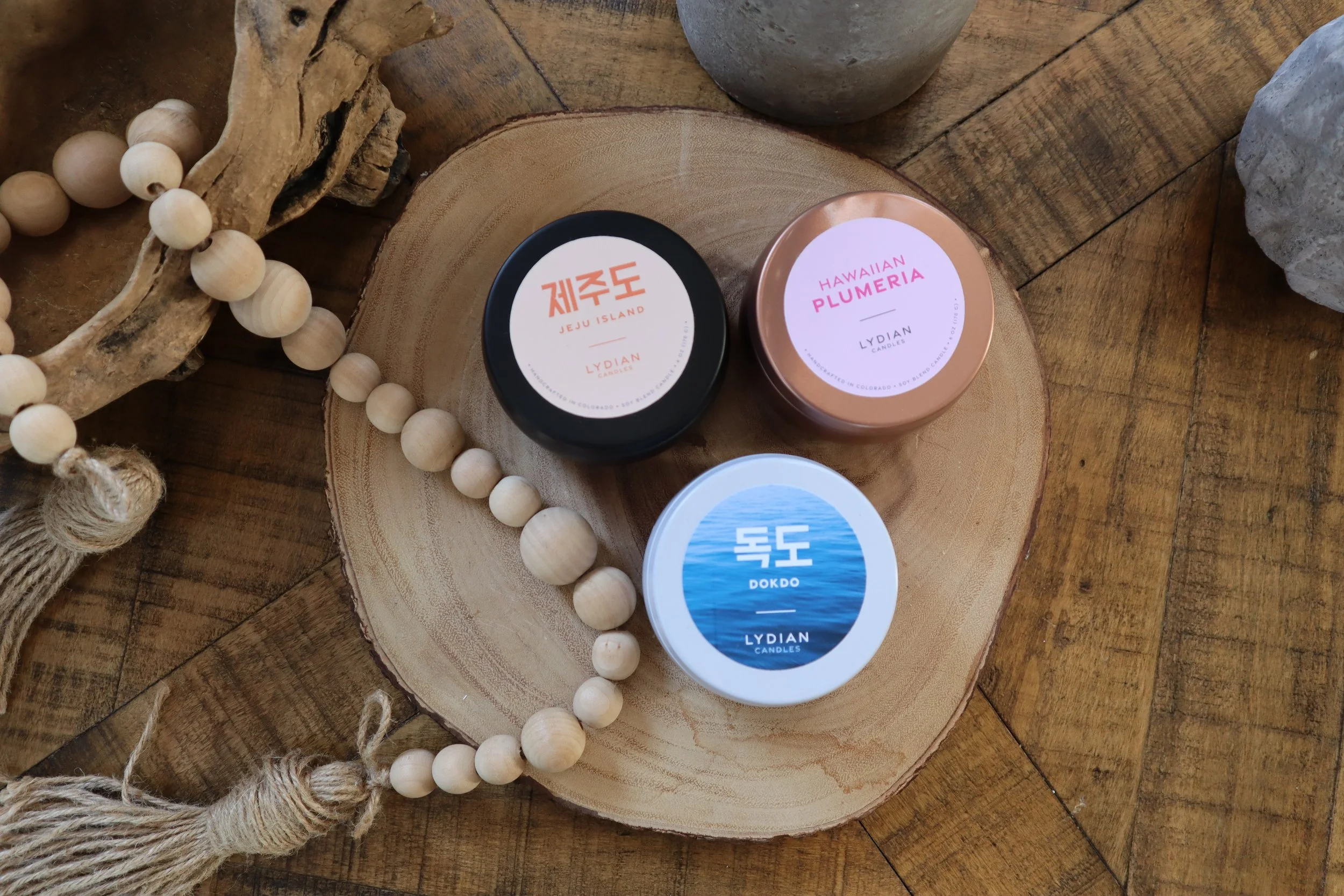
Concept & Execution: I developed the full brand identity based on a rich, multi-layered foundation: my Korean-Celtic heritage, global travels, and personal memories.
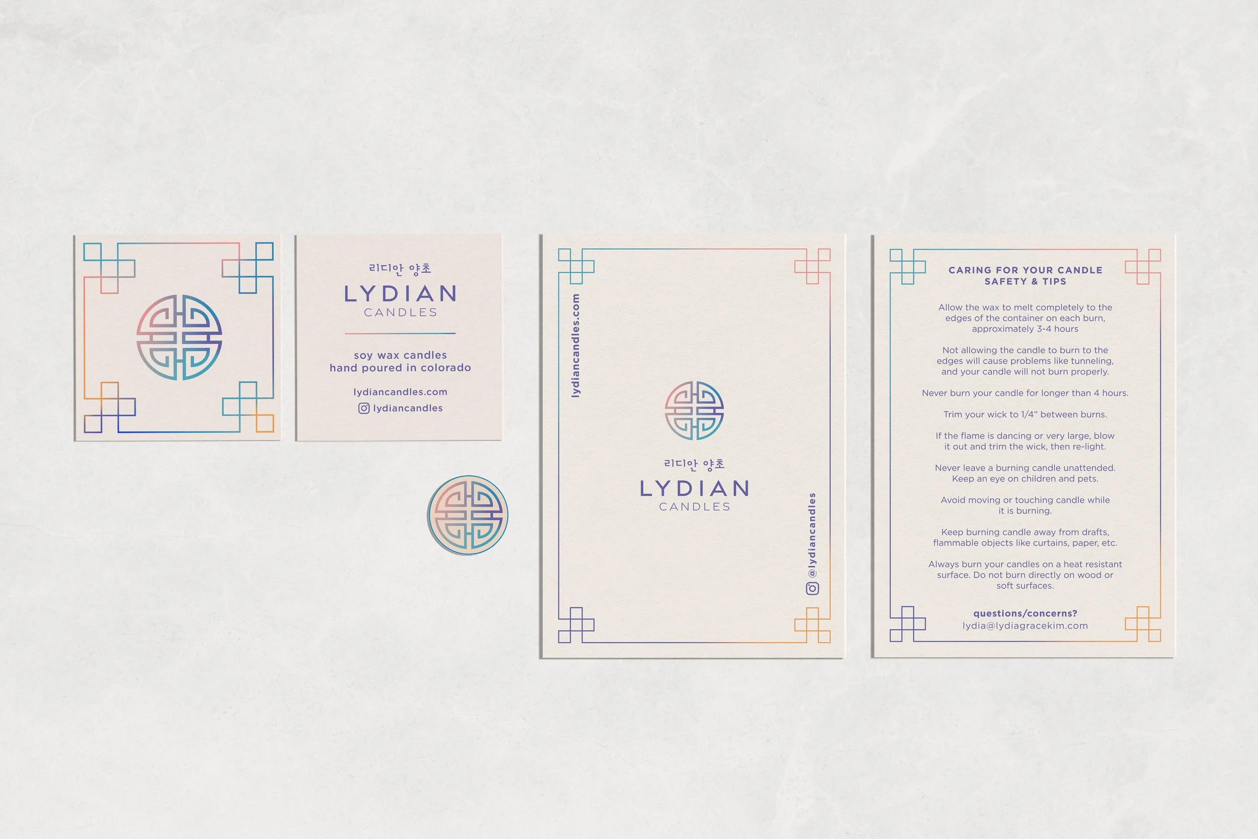
Logo & Heritage: The logo mark is directly sourced from a traditional Korean pattern (often seen on Hanbok and Buddhist temples), serving as a powerful, personal symbol of self and culture.
Color & Identity: The color palette and patterns strategically use a mixture of colors to represent my identity as a mixed-race individual, reflecting the amalgamation of cultures within me. The primary use of purple was chosen specifically because it symbolizes spiritual awareness and abundance in both my Korean and Celtic ancestry.
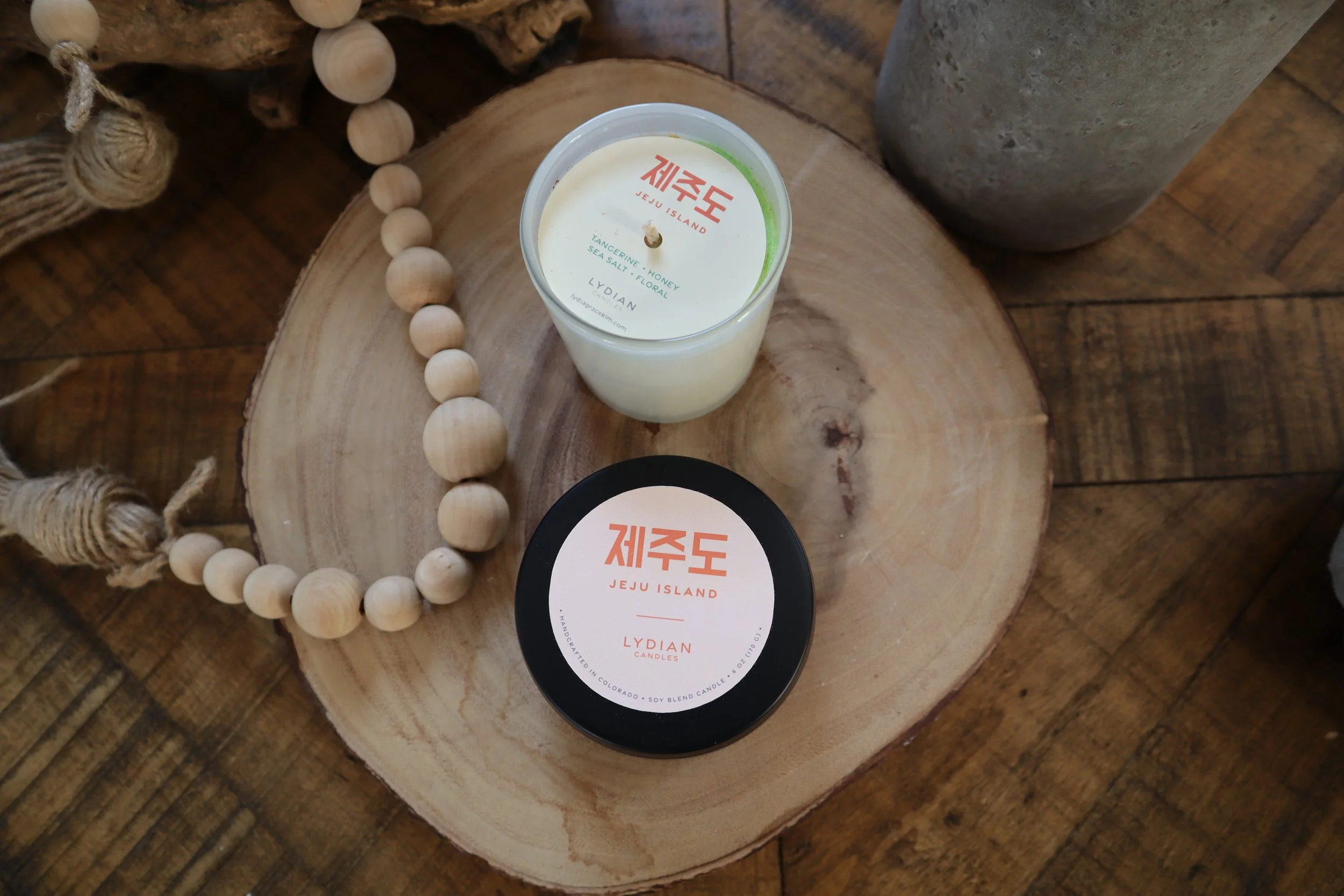
Impact: This deeply conceptual identity created an authentic brand story that resonated immediately with consumers, directly fueling the conversion of a personal project into a successful purchase-driven business. The brand's visual identity now serves as a sophisticated, authentic narrative that differentiates the product in the artisanal candle market.